#7 Material cards
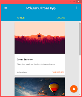
In the previous post, we added tabs to our Polymer Chrome App. Now we add some content to the first tab - CARDS. This may be seem a little off-topic but I will be using Angular Material JS, to show that one need not rely on Polymer for implementation of material design.
The Angular Material project is an implementation of Material Design in Angular.js.
bower install angular-material --saveInclude the following Angular Material dependencies.
<!--Angular-Material Dependencies-->
  <link rel="stylesheet" href="bower_components/angular-material/angular-material.css" type="text/css">
  <script src="bower_components/angular/angular.js"></script>
  <script src="bower_components/angular-material/angular-material.js">
   </script>
Now we use core-animated-pages, where we add content to tabs using sections.
Here is a little help where the Tab content should go....
<!--Main Toolbar-->

 <core-header-panel>
  <core-toolbar>
    <div>
      ** Toolbar heading **
      ** Dropdown Menu **
    </div>
    ** Paper-Tabs **
  </core-toolbar>
  <!--Main content goes here-->
    <core-animated-pages>
     <!--First Tab-->
       <section>
        * First Card *
        * Second Card *
        * Third Card *
       </section>
     <!--Second Tab-->
       <section></section>
    </core-animated-pages>
</core-header-panel>
Now it's easy for you guys to put the stuff...I am adding only one card, rest you can add yourself.
<core-animated-pages selected="0" transitions="cross-fade">
 <!--First Tab-->
  <section vertical layout center>
   <!--first card-->
   <md-card cross-fade class="card">
    <img src="assets/forest-patrol.jpg" class="md-card-image" alt="image caption">
    <md-card-content>
     <h2>Green Essence</h2>
     <p>Take a deep breath and dive into the beauty of nature.</p>
    </md-card-content>
    <div style="display:flex;flex-direction:row;justify-content:space-between;">
     <md-card-footer >
      Author: Akshay
     </md-card-footer>
     <paper-button style="color: #FF6600;align-self:center;">Take me there</paper-button>
    </div>
   </md-card>
  </section>
 <!--Second Tab-->
  <section vertical layout center><h1 cross-fade>Hello World</h1></section>
<core-animated-pages>
A little tweak to show cards perfectly...
.card {
 width: 65%;
 height:auto;
 background-color:white;
 border-radius: 4px;
}
.md-card-image { /*coz image borders are not automatically curved*/
 border-top-left-radius: 4px;
 border-top-right-radius: 4px;
}
But wait...nothing happens when you click the other tab. My friend, you forgot the javascript.
var tabs = document.querySelector('paper-tabs');
var pages = document.querySelector('core-animated-pages');

tabs.addEventListener('core-select',function(){
  pages.selected = tabs.selected;
});
Yes, now it's working.
NOTE:
- When you use polymer elements by their element name (like paper-tabs), use document.querySelector, instead of document.getElementById.
- Do Not use the cross-fade animation keyword in the "section" tag. Use it instead in the child element like "md-card", "h1", etc.
- IMPORTANT -- > Polymer and AngularMaterial may interfere with each other, so this tutorial may not work for you. If it doesn't...try to update Chrome, otherwise Polymer is always there.


Comments
Post a Comment